 Sometimes published ads are borderline offensive or go beyond that line. I thought this ad was offensive to women because of the language they used and the implied meanings.
Sunday, June 5, 2011
ads that may be deemed offensive or are offensive
Sometimes published ads are borderline offensive or go beyond that line. I thought this ad was offensive to women because of the language they used and the implied meanings.

Sunday, May 29, 2011
Honda Accord- The Cog
http://www.youtube.com/watch?v=_ve4M4UsJQo
I really like this commercial due to its very difficult nature to produce. I did some background research on it and it mostly consists of non computer generated video. The only computer modified parts were things like high-lighting the water, zooming in, and stitching the 2 continuous 60 second clips as one. I like seeing simple things yet complicated to set up as advertisements.
Saturday, May 28, 2011
Internet Ad
 I stumbled upon an ad relating to our current project for the ad advertising direction class. I like how they make the speed relating to how cars hit bugs on the freeways but on the person's face. Coming up with a concept like this seems easy but is actually very difficult without being too conceptual or too literal.
Sunday, May 15, 2011
Simple posters that are funny


Both these pictures are simple, funny, and have an idea behind them. However, the giraffe picture wouldn't be as funny without the text. The proposal picture doesn't even have descriptive text and makes sense. I see a lot of people making these motivational posters (giraffe) and even though they are funny sometimes, they don't have a meaning beyond that. The proposal one is simple yet communicates a meaning to it. I think being simple yet meaningful are good ways to communicate with people because most people today are too lazy to read long text paragraphs.
Saturday, May 14, 2011
John Coy Guest Speaker GAUGE
John Coy's presentation was not as strong as the other speakers I have seen before. He did give a lot of information about building yourself to become great. The work he showed were interesting but not mind blowing. I guess it might be due to a generation difference. I was disappointed in how the people organizing the event could not get his presentation to load. However when I caught a glimpse of the 1.7~ GB file size of his power point file, I realized why the computers were having trouble. Aside from his presentation, I felt he seemed like an open guy to talk to and would not mind helping the younger generation if needed.
Sunday, May 8, 2011
Product Placement
http://www.youtube.com/watch?v=4LFQIoc49ZM
Product placement is used in a lot of places, especially television and movies. I think sometimes too much product advertisement can be bad though, like in the movie Transformers. Almost every 5 minutes you see 1 or more product advertised somewhere in the scene. The car scenes are almost too obvious with the camera panning over the cars. If the clip was shown without any Transformers related material and shown with the product information it would pass off as a regular car commercial.
Sunday, May 1, 2011
some interesting commericals
http://www.youtube.com/watch?v=_TKQWYUegXQ
Out of all the commercials shown here, I liked the shaving blade one where the match wouldn't light up and the Audi one. At first I didn't get why he would put the match in his mouth and why it wouldn't light up. But after the woman took it and lighted it up, it made sense and was pretty funny. The Audi one was really creative as it praised each different car for what they were good at, but at the end it combined everything. The message was simple and easy to understand. The commercials I like see are those that are straight to the point and executed in an simple and easy to realize the intent ones.
Saturday, April 30, 2011
creative packaging
http://www.toxel.com/inspiration/2009/04/04/20-unusual-and-creative-packaging-designs/
I liked the Newton shoe packaging, Nike stadium shoe box, and the anti-theft bags. Some of the other packaging ideas are nice too but those three stand out more to me. The Newton shoe packaging was interesting because when I buy shoes, they tend to come in clunky boxes and sometimes it's hard to put the shoes back in and have it fit in the box. The Newton box would be easier to put back in the box and also save materials to make the box. The Nike box is just awesome, a stadium within the box and the sound of the crowd when you open the box? What a very unique way to show off their product. The anti-theft bags made me laugh because kids always have their lunches stolen by bullies. At least what the media and entertainment show us. Just having the reaction of the bully seeing the fake mold would be priceless.
Sunday, April 24, 2011
Godzilla Doritos Commercial
http://www.youtube.com/watch?v=8eCDl0Hbs38&feature=related
I thought it was interesting that they used Godzilla for the Doritos commerical. It was one of my favorite movies as I was always fascinated by the old Godzilla Japanese movies. They replaced the fish with the Doritos truck which those people that have seen the movie could relate to. I think using a scene from a movie and change it up to make a commercial for something that wasn't in the movie is a good way to appeal to those who have seen it before.
Sunday, April 17, 2011
Logo Design Tip site
As we all know, designing a logo is not easy. It seems easy at first glance, but to make a truly good logo, it takes a lot of time and effort and sketching. I found a site with good ideas and tips of how to make logos and a bunch of other design related help articles. His site logo is very interesting too; it took me a while to notice his intention of making it like that. http://justcreativedesign.com/
Saturday, April 16, 2011
Extreme Advertisements
I found a few extreme advertisements that give off a very powerful message. I'm only going talk about this one though. http://net.onextrapixel.com/wp-content/uploads/2010/01/road-safety-australia.jpg Instead of just having the ad say to slow down, they show a strong image of a speeder running down a family. I think it does make people realize they shouldn't drive so fast around neighborhoods and school zones. The skid marks and smoke on the rear tire show that the person driving did not have enough time to slow down.

Sunday, April 10, 2011
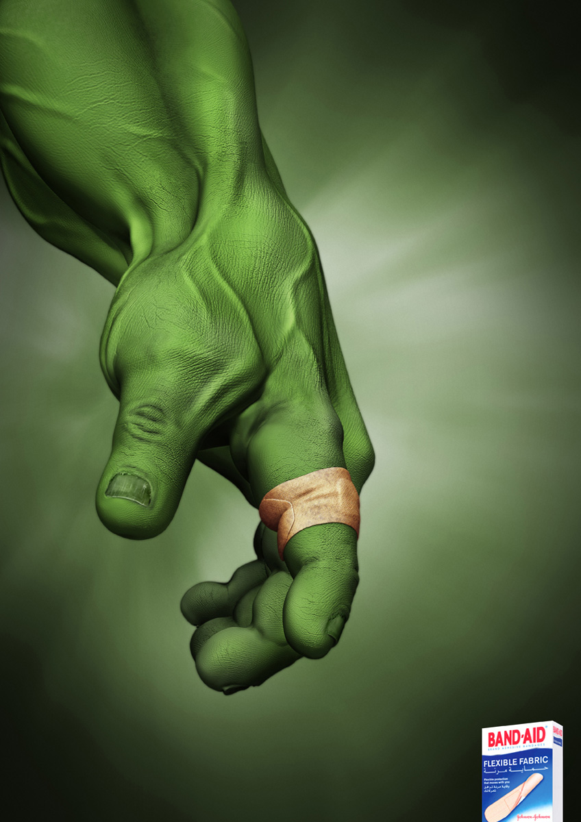
Hulk Band Aid Advertisement
Someone brought in an Ad focusing on a picture of a muscular green arm with a Band Aid on one of the person's fingers. My first impression was that it bugged me to see, what I presumed to be, the Hulk wearing a Band Aid. I've done research about the Hulk prior to seeing that ad due to personal interest and I know the Hulk has highly advanced regenerative powers. The message I got from that ad was that even if the wound would be so bad the Hulk cannot heal from it, the Band Aid would strong enough for him. However someone gave an interesting viewpoint on the ad. She mentioned how Bruce Banner, the human form of the Hulk, was the one who needed the Band Aid. The Band Aid, advertised as flexible, would be able to stretch as Banner turned into the Hulk as his size increases a great deal. Another interesting viewpoint I heard was how that could be interpreted as the hand of God. The Band Aid would be so good that even God decided to use it.
Saturday, April 9, 2011
Advertisement Wars
I found these series of ads on another site, which I wasn't able to locate, but found them on this blog again. It is interesting to see how different companies compete with each other, even to getting how Bentley just used their "crude", simplistic method.
Subscribe to:
Posts (Atom)